Case study · Side project
samesong
Building a social concert app from the name up: brand, onboarding, and motion.
Outcome
A brand and a complete onboarding flow, from first launch to finding friends, with motion prototypes for the trickier interactions.
Overview
samesong is a social concert app concept. It helps people find friends with similar music taste, see which shows their friends are going to, and make plans to go together.
It was an idea I never fully built, but I loved designing for it. I started with the brand: the name, a nod to Digital Underground's “Same Song,” along with the wordmark and a small singing bird. It was the first branding project I felt really proud of.
From there I moved to onboarding, because it's the first impression, and it's where the app learns enough about someone to be useful right away: their music, where they live, and who their friends are.
Music
is
better
together
The problem
Live music is better with friends, but the apps people use to find concerts stop at the show. They recommend what to see, not who to see it with, and that's often the reason people stay home.
I wanted samesong to handle that part: finding friends with similar taste, seeing who's going, and making plans together.
Research
I started by asking people directly, with a 24-hour poll on Instagram Stories.
Most people only made it to a couple of shows a year, and it wasn't for lack of options. Many already heard about concerts through social media. What held them back was finding someone to go with.
People didn't need another way to find shows. They needed an easier way to make plans with each other.
Next, I looked at the apps samesong would sit between. Concert apps like Spotify, Bandsintown, and AXS are good at discovery, but none of them ask you to sync your contacts. So I also studied social media apps, apps that add a social layer to books and movies, and event apps like Meetup and AllEvents. Neither event app asks for contacts during onboarding, even though their App Store pages lean on it.
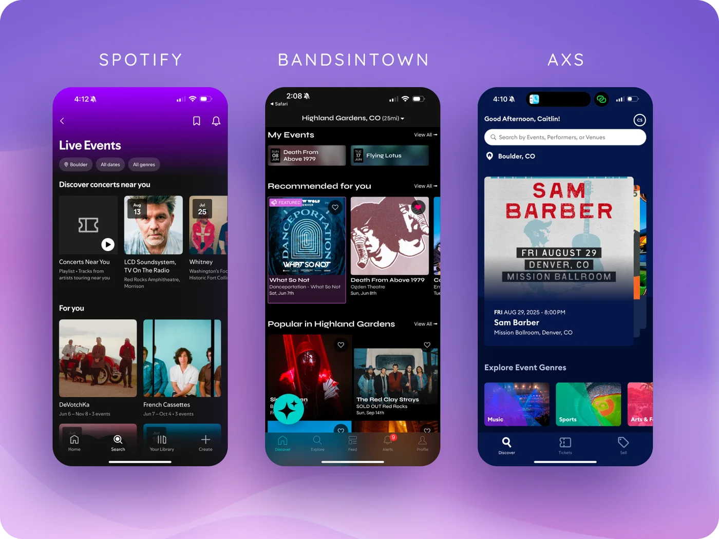
Comparing their onboarding flows, a few best practices stood out. Here's what I saw, and how each one showed up in samesong.
SawThe best flows kept setup short and used a progress bar to show how far along you are.
Didsamesong takes four steps, and the progress bar fills a little more with each one.
SawBandsintown's carousel made picking artists feel playful.
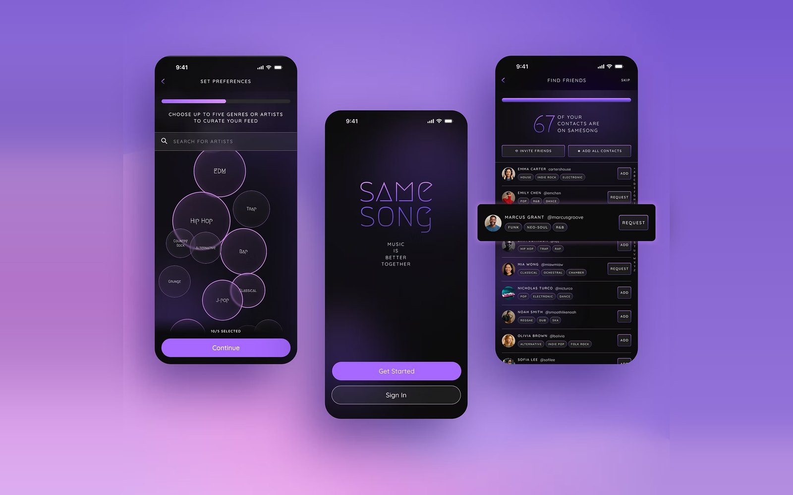
DidI prototyped genre bubbles you tap to choose, as a more playful option than a plain list.
SawBandsintown never said when you'd picked enough artists. The button just quietly switched on.
DidA counter shows your progress toward five, and Continue only lights up once you get there. You can still pick more.
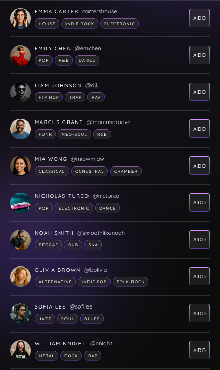
SawCo-Star turns your contacts into a branded list with avatars and signs.
DidEach contact shows the genres they love, so you can spot your concert people before you add them.
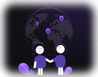
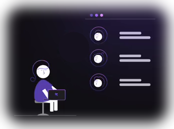
SawConcerts are fun, and samesong is fun. Onboarding should get people excited early.
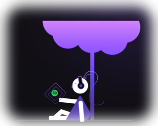
DidIllustrations and small moments of motion carry the brand through every step.
Mapping the flow
Before designing screens, I mapped every way into the app: signing in, signing up with Google, email, or Spotify, and what happens when an account already exists. New accounts then move through music taste, location, and finding friends, one task per screen, each with a clear way to skip.
The friends step
This is the step that matters most. If people skip syncing their contacts, samesong has nothing to show them, so this step had to feel worth it.
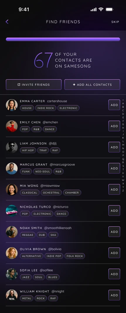
Instead of a plain list, each contact shows the genres they're into, so it's easy to see who you'd actually want to go to a show with.
A count at the top shows how many friends are already here, and adding everyone takes one tap.
Design principles
Four principles kept the flow simple and calm. They make onboarding easier for everyone, and they especially help people who are sensitive to motion or busy screens.
Transitions are gentle and linear. Even the ambient glow on the welcome screen moves slowly.
Next steps and testing
Alongside the main flow, I built a small prototype in Figma Make: a playful way to choose genres by tapping floating bubbles. The next step would be testing it against the standard genre list to see which people find faster and more fun.
- →Run usability tests on the prototype with a handful of people
- →Test single-task screens against one dense account form
- →Explore settings like a reduced motion mode
- →Design the profile, with favorite artists, upcoming shows, and artists you share with friends
- →Design a home feed built from your artists, location, friends, and trending shows
Reflection
- 01A quick poll was enough to startA 24-hour Instagram poll wasn't formal research, but it was enough to show the real problem was finding company, not finding shows.
- 02Prototyping the feelStatic screens couldn't show how the glow or the bubbles should feel. Small prototypes in ProtoPie and Figma Make were the only way to get them right.
- 03Designing for comfortDesigning for people who get overwhelmed easily made the whole flow simpler, and it got better for everyone.